Wednesday, 20 February 2013
Friday, 15 February 2013
Tuesday, 12 February 2013
Friday, 8 February 2013
College magazine cover draft
This is the draft version to the front cover of my college magazine, and I expect that some changes will be made to it.
Wednesday, 6 February 2013
College magazine photographs
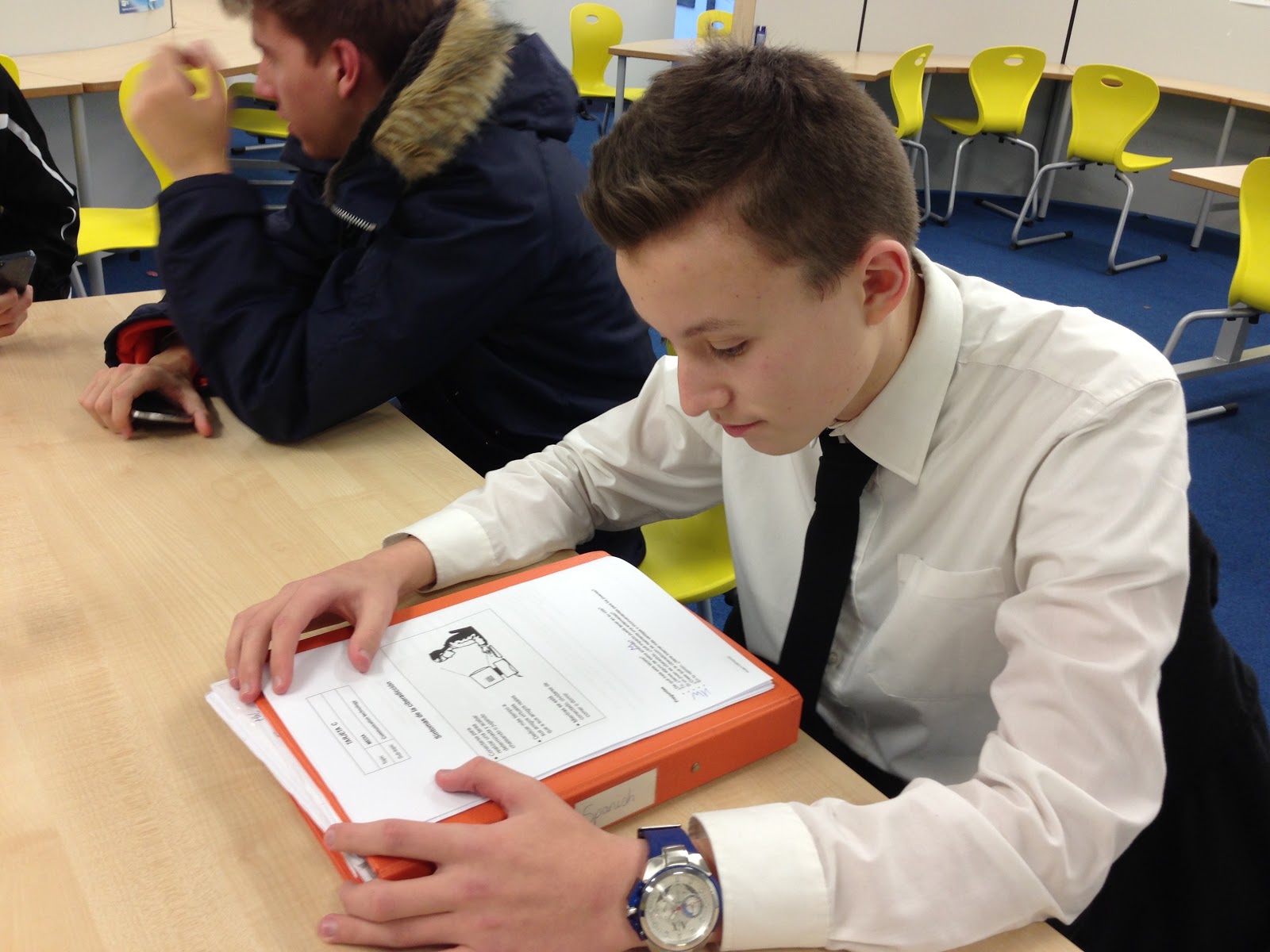
For the college magazine I had to take photographs around my Sixth Form to use on the front cover of it, here they are and if I think they're suitable for use
I won't use this medium-shot of a student looking at a map as it doesn't look appealing for a front-cover to make someone pick up the magazine
This is a good landscape shot of the study room and would possibly be used in a contents page but as a front cover I'll opt for something a bit less vague.
This will be the image I will use on the front cover of my college magazine as the medium shot fits right and the high angle gives a perspective of the work being revised at the college.
This is a good image of a fellow student working and could go well in a magazine article but I have already chose the above image to be used on the cover.
The high-angle image of the stairs (like the above image) would be used in an article of a college magazine rather then a cover.
Tuesday, 5 February 2013
College magazine analysis
What images have they used? What camera angles/shots have been used?
The image that has been used is a medium shot of two children smiling at the camera.
What is the mise-en-scene on the front cover?
The mise-en-scene on the front cover is two children in front of a green park-like background grabbing onto something with another child in the background on the extreme left with their back turned to the camera. The child at the front of the shot has a striped vest on, the child in the centre is wearing an orange shirt and the child in background has a blue polo shirt. The lighting is bright with the natural sun most likely being used.
Does the front cover engage the audience and why?
In my opinion the front cover does engage the audience as it features a headline involving children and their futures which can be a curious subject to college students who care about their younger relatives or possible children and wish to know more about their futures.
Who is the target audience? Age, gender, ethnicity, lifestyle etc
The target audience for this college magazine would obviously be college students, but also to people who are looking to possible enrol in the college and take a course there. So this would be the age of 16+, both males and females of all ethnicities. I imagine the lifestyle would be those who have college as a prominent part of their lives and wish to continue reading about it.
How does the magazine engage the target audience?
How the magazine engages the target audience is by having the big red banner for the masthead and the large bright main image of the cover. The colours are smooth and easy on the eye compared to being too extravagant with too much going on.
How do you know it is for this particular target audience?
How you know it is for this target audience is it having 'University' prominently next to the magazine name meaning the magazine is based around that and targeted to people interested in colleges and universities.
What is the ideology of the magazine?
The ideology of this magazine is for college students to learn more news and find out more about the college they attend or are planning on attending.
What does the college consider important?
What the college considers important is the future of children who could potentially attend the college and using this to get people to pick up the magazine and read, as it could be a subject which means much to them.
Does the front cover engage the audience and why?
In my opinion the front cover does engage the audience as it features a headline involving children and their futures which can be a curious subject to college students who care about their younger relatives or possible children and wish to know more about their futures.
Who is the target audience? Age, gender, ethnicity, lifestyle etc
The target audience for this college magazine would obviously be college students, but also to people who are looking to possible enrol in the college and take a course there. So this would be the age of 16+, both males and females of all ethnicities. I imagine the lifestyle would be those who have college as a prominent part of their lives and wish to continue reading about it.
How does the magazine engage the target audience?
How the magazine engages the target audience is by having the big red banner for the masthead and the large bright main image of the cover. The colours are smooth and easy on the eye compared to being too extravagant with too much going on.
How do you know it is for this particular target audience?
How you know it is for this target audience is it having 'University' prominently next to the magazine name meaning the magazine is based around that and targeted to people interested in colleges and universities.
What is the ideology of the magazine?
The ideology of this magazine is for college students to learn more news and find out more about the college they attend or are planning on attending.
What does the college consider important?
What the college considers important is the future of children who could potentially attend the college and using this to get people to pick up the magazine and read, as it could be a subject which means much to them.
Monday, 4 February 2013
Using Photoshop
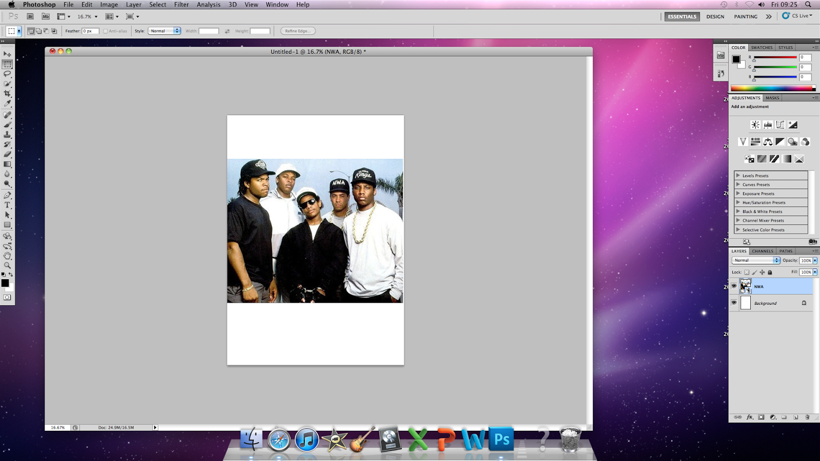
I opened Photoshop and chose the paper size to be the standard A4.
I put in a picture of the hip-hop group N.W.A.
I right-clicked the layer of the picture and rasterised the image so it is available to edit.
I selected the Magic Wand tool...
...then removed the background as seen above.
I then inserted a background image which is completely different yet fits and looks like nothing has been edited.
While basic, these tools have helped me get used to Photoshop and be able create my magazine cover, contents and double page spread to a higher standard in the future.
Subscribe to:
Posts (Atom)